


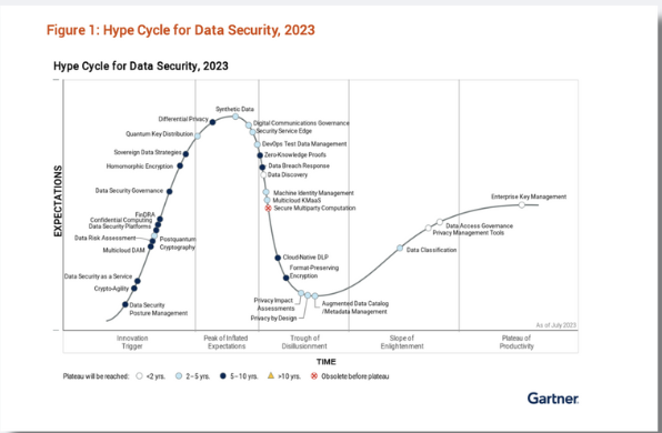
Designing Scalable, Secure Interfaces for Modern Compliance
A UX/UI case study for a SaaS platform trusted by Goldman Sachs, Wells Fargo, and other enterprise clients
Role
UX / UI Designer
Year
2022-2024
Tools
Figma
Jira
Google Workspace
Adobe Illustrator
Project Overview
As the first and only UX/UI designer at Theta Lake, a RegTech SaaS company, I led UX/UI efforts to improve and scale platform features that help large financial institutions like Wells Fargo, Goldman Sachs and UBS maintain communication compliance.
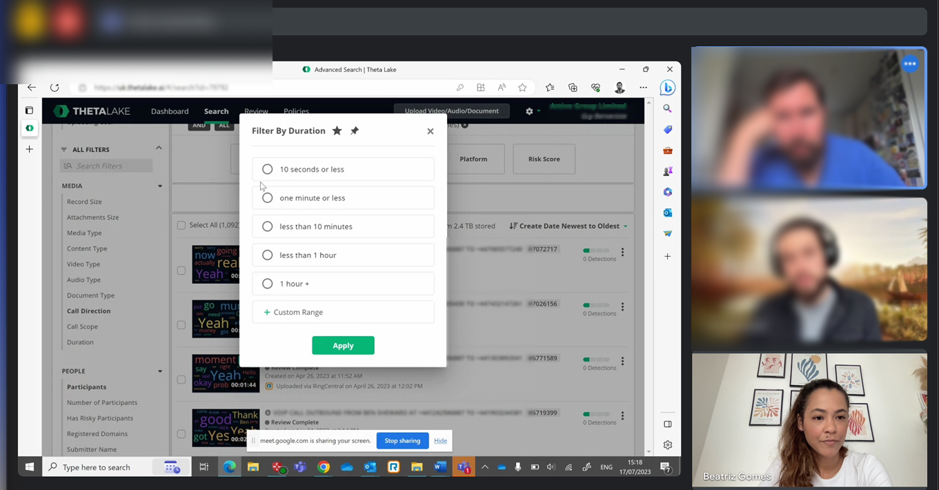
The platform ingests and analyzes data from tools like Zoom, Microsoft Teams, Webex, and RingCentral, helping compliance teams review, manage, and archive large volumes of video, audio, and chat content.
This showcase combines a set of initiatives where I contributed to key components, from dashboard overhauls to interaction patterns, with a focus on clarity, accessibility, and trust in data-heavy environments.

My Role & Scope
Role: Sole UX/UI Designer
Team: PM team, reporting to CFO, working with engineers, Field Technical Support, sales engineers, and compliance SMEs.
Product: AI-assisted compliance & supervision platform for enterprise UCC (Unified Communications & Collaboration)
Clients: Financial institutions and wealth management firms, including Goldman Sachs, Wells Fargo, UBS
Users: Compliance analysts, risk officers, IT admins
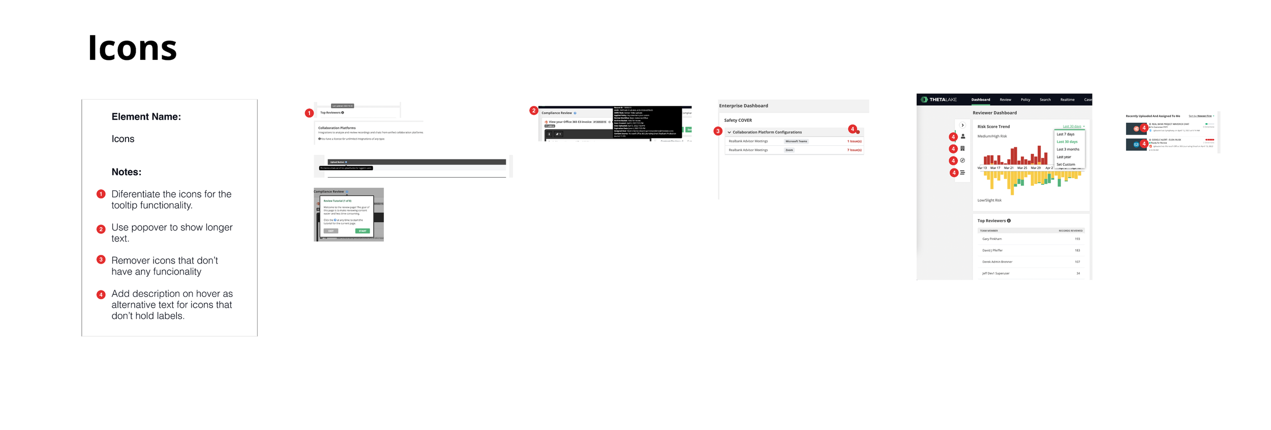
My Focus Areas: Dashboards, data viewer, review panels, metadata filters, ingest timeline, alerts, modal redesigns, accessibility, and the design system
Problems & Insights
These issues increased onboarding time, reduced trust, and hindered adoption—especially critical in financial compliance, where speed and accuracy matter.
Poor learnability for new users, especially analysts and admins
Dense, unstructured information display that slowed task completion
No unified visual language or accessibility support
Low usability and inconsistent UI
Process & Strategy
Working with limited research access due to data sensitivity, I:
Initiated internal audits and heuristic evaluations
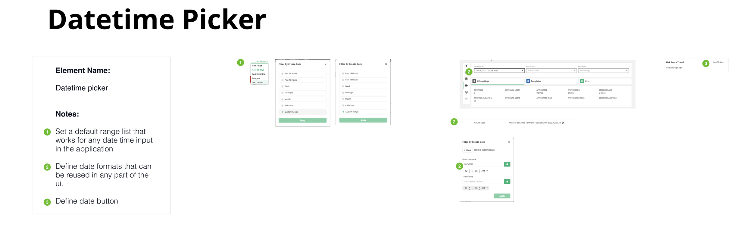
Developed and implemented a long-term design system strategy for consistency, scalability, and accessibility (WCAG)
Interviewed internal and external teams and collected contextual feedback
Real insights from the field
A meeting with a Wells Fargo user where we explored how to surface cross-channel conversation patterns—and how the new timeline view could streamline their compliance investigations.

Used Pendo data to track usage and identify user behavior patterns
What Are the Solutions?
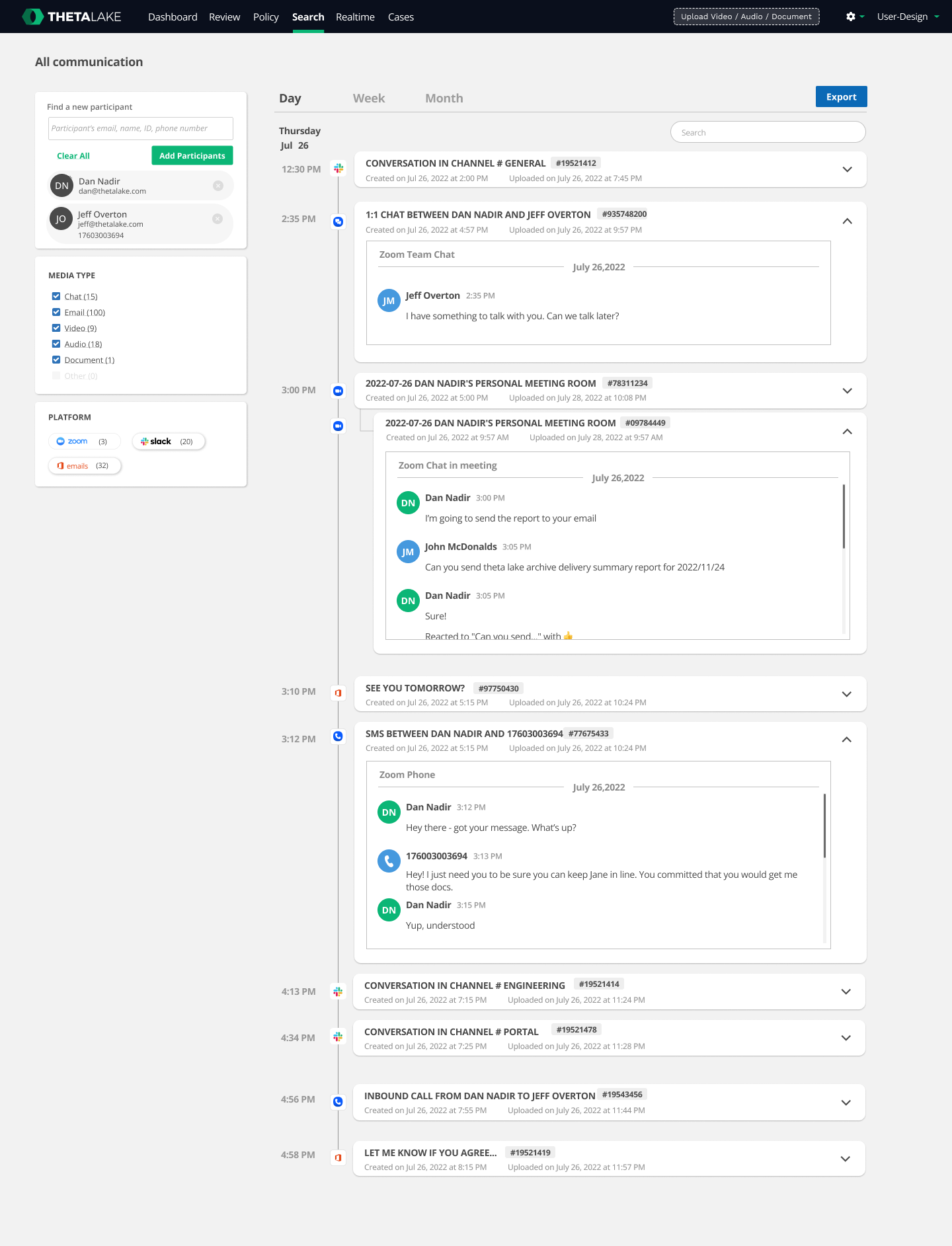
Conversation Reconstruction Timeline
Problem:
Compliance analysts needed to understand who was communicating with whom, when, and across what channels—especially when messages spanned multiple modalities like video, chat, voice, and screen sharing. Existing tools failed to reconstruct the full context of conversations.
Solution
I designed a Conversation Reconstruction Timeline that visualizes multimodal communication on a unified, scrollable timeline—respecting chronological behavior and allowing users to see the full narrative thread of a conversation in one place.
Impact:
Improved user ability to reconstruct events across platforms, making investigations more efficient and intuitive in high-volume environments.
Key UX contributions:
Created interaction patterns that stacked content types by modality (chat, audio, video, file share, etc.)
Designed color-coded markers and interactive filters to isolate participants, risks, or content types
Incorporated risk flags, policy matches, and metadata directly into the visual layer, enabling analysts to spot critical insights faster
Introduced hover and expand behaviors to make dense data scannable without overwhelming the screen
Prioritized accessibility and data readability across time-based and nested interactions
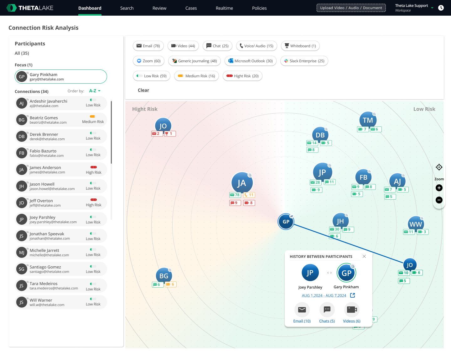
Connection / Participant Graph View
Problem:
Users often needed to analyze communication networks—who is connected to whom, what channels they use, and whether suspicious connections exist across departments or external parties. The existing UI offered no meaningful way to cross-reference this at a glance.
Solution
I designed a Participant Graph View, a visual-first alternative to the timeline, where communication links are represented as nodes and proximity paths between avatars or identities.
Impact:
Helped users visualize emerging communication patterns and clusters—supporting risk detection at a network scale, not just an individual conversation level.
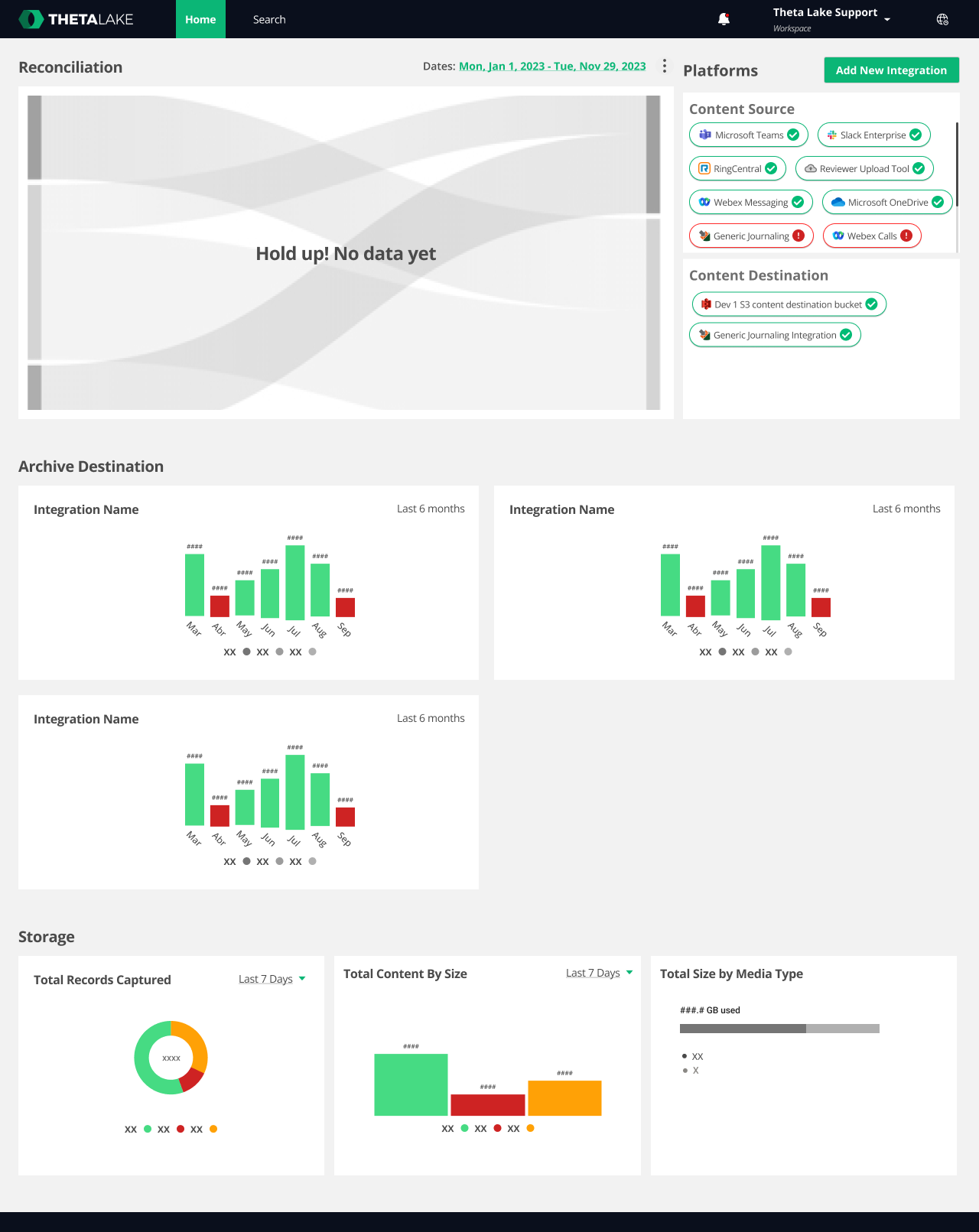
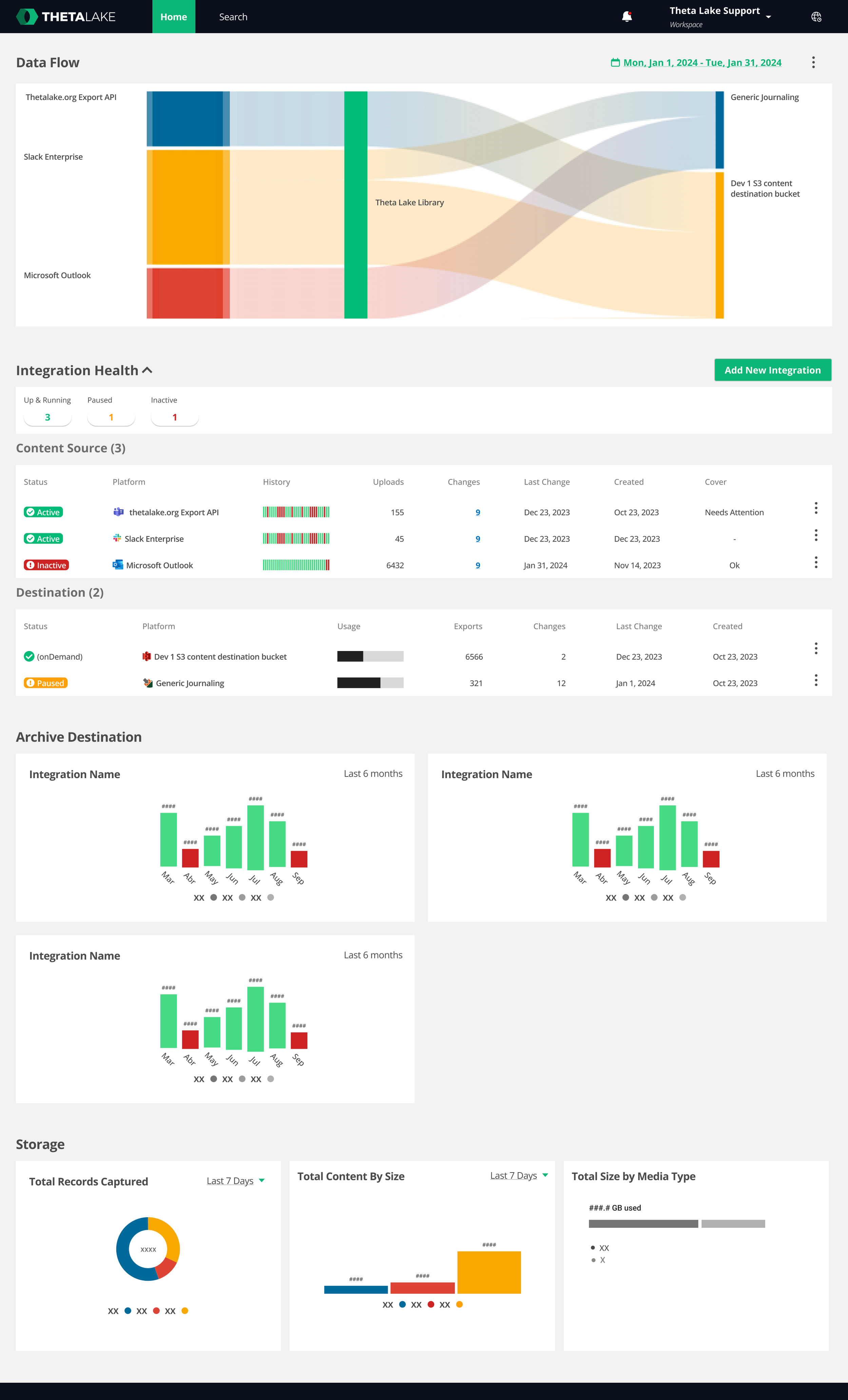
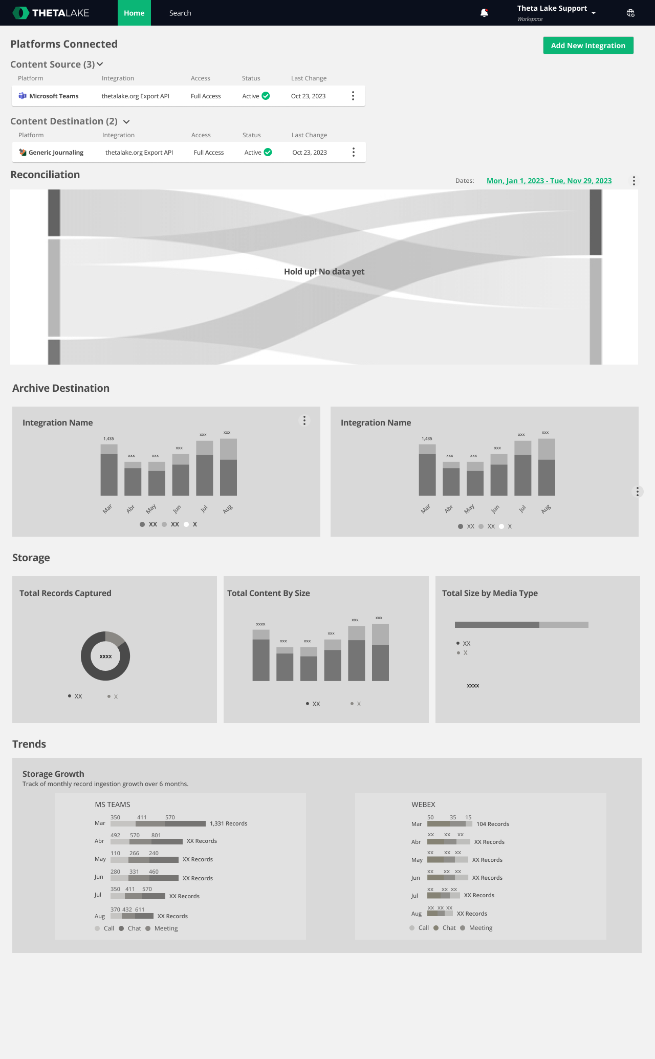
Unified Capture Dashboard
Problem:
Users lacked visibility into what content was actively being ingested, which integrations were working, and how data was being routed across the system. This ambiguity led to delays in identifying ingestion issues or missing content.
Solution
I designed a Unified Capture Dashboard that visualized ingestion flow and real-time platform status, helping users gain immediate system awareness.
Impact:
The dashboard reduced confusion about system state, improved trust in ingestion pipelines, and allowed users to proactively monitor risks in real-time.
Key UX contributions:
Introduced a Sankey diagram to illustrate ingestion → routing paths by source (e.g., Zoom, Teams, Slack)
Designed dynamic tables that show ingest status (running, paused, error) with quick actions to view content or logs
Built interactive data breakdown charts with filters for time range, risk levels, and source system
Created entry points to other tools (e.g., content viewer, connection graph) directly from dashboard
Ensured responsiveness and accessibility for high-density views
Key UX contributions:
Designed a modular, expandable network graph with clustered participants
Used proximity, connection thickness, and frequency markers to indicate relationship strength and frequency
Incorporated interaction filters: users could zoom, isolate, or highlight nodes by policy match, content type, or channel
Supported seamless switching between timeline and graph modes, preserving context between views
Outcome
These design improvements supported product and business goals:
Increased analyst task efficiency by up to 25%
Reduced support tickets related to ingest or policy visibility by 30–40%
Strengthened product perception and trust from Tier 1 clients in finance and compliance
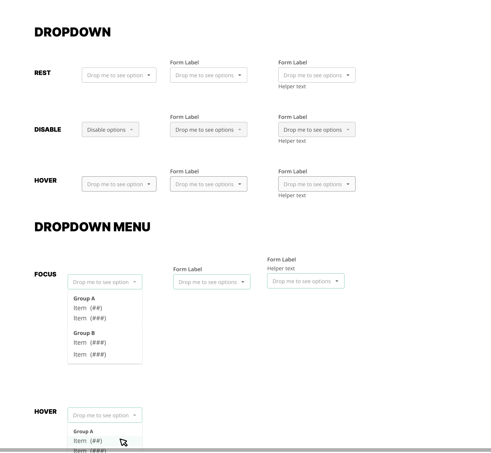
Delivered 20+ components to the evolving design system
This case study represents my approach to improving enterprise platforms: thoughtful, systematic, and user-centered. If you're solving for scale, complexity, or compliance in your product, let’s talk.